Samba Analytics
Samba TV is a TV research and analytics company. Its software is embedded in TVs around the country and can aggregate and analyze TV viewing behavior. This powerful data is used by TV broadcasters and advertisers to better understand their viewers. I led design for the initial version of Samba Analytics, Samba TV's flagship analytics product.
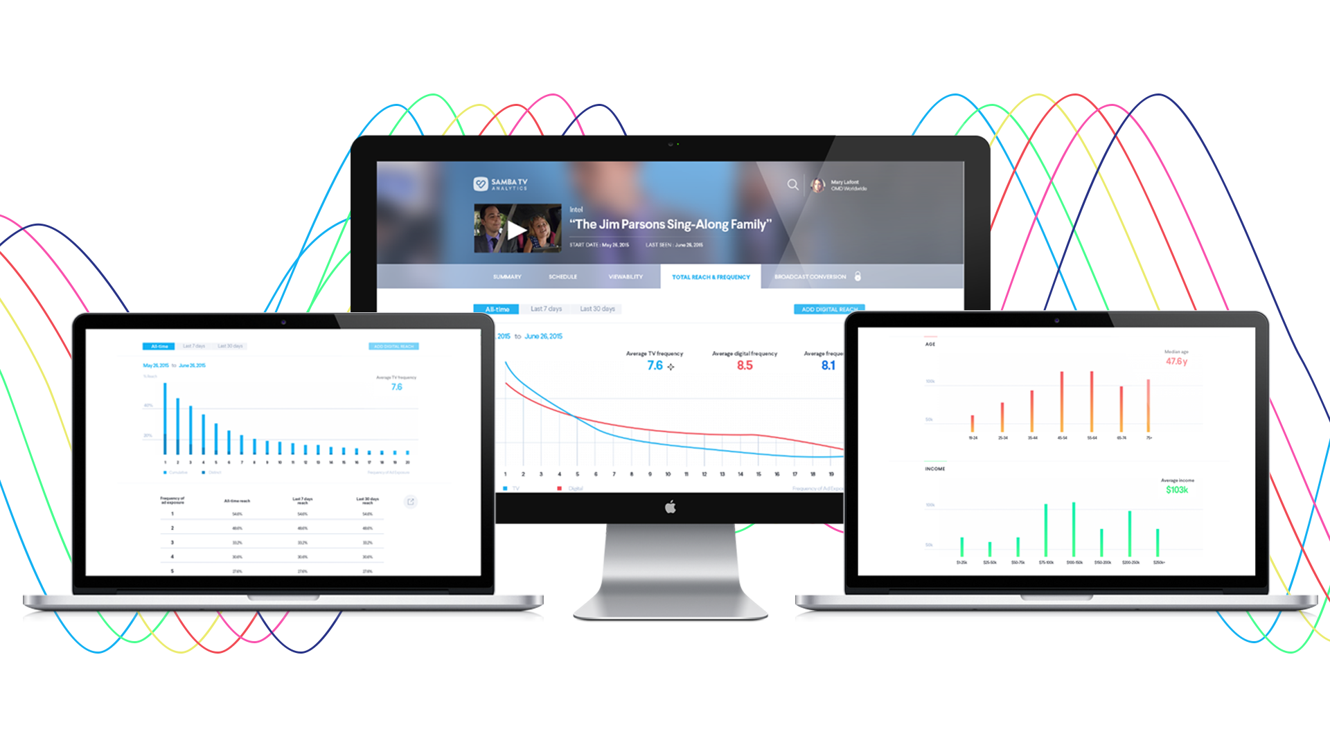
In 2016, Samba TV had TV viewership data coming in from TVs around the country. This data was manually packaged up and resold to TV broadcasters and advertisers who wanted to better understand their audience. While this was working well for the company, it wasn't scalable and was leaving a huge opportunity on the table: a self-serve analytics platform that would allow broadcasters and advertisers direct access to the viewership data they wanted, plus the ability to slice and dice the data across multiple behavioral and demographic criteria.
For example, CBS wants to know how many people watch The Big Bang Theory each week. Traditionally, this information is provided by Nielsen, which collected data from 25,000 homes around the US. By using a carefully-calibrated sample, they could extrapolate up to estimate total viewership across the US. But as online advertising became more and more powerful and precise, TV advertisers wanted the same thing in TV ads. And with Nielsen's small sample size, it could only be sliced up so far before the data couldn't be extrapolated upon.
Samba TV's sample size is many times larger, allowing detailed segmentation. For example, by partnering with other data providers, CBS could determine not only how many people watched The Big Bang Theory last night, but it could zoom in and estimate how many of those people were men, 18-35, married, living on the west coast, and in the market for a new car. This unprecedented level of detail is extremely powerful and would allow CBS to charge more for their TV commercials. In turn, advertisers are willing to pay more to target the exact consumer they are trying to reach, instead of wasting money on ads for people who would never buy their product.
On the advertiser side, advertisers are trying to get the best bang for their buck. By enabling precise targeting, advertisers can discover what shows and networks their target audience is watching. In addition, they can monitor the performance of their already-airing commercials.
To better understand how our potential customers might use this data and how we might be able to build our analytics product to meet those needs, I went to New York with my head of product to meet with broadcasters and advertisers.
Advertisers' biggest need was simple: they wanted to see when and where their commercials aired. In the days after a commercial's airing, they only had the broadcasters' word that the commercial aired at the time that was paid for. Nielsen commercial ratings could come weeks later, which was too late for advertisers to make on-the-fly decisions around their companion digital media campaigns.
Ad campaigns could last months and contain hundreds of airings across multiple TV networks, so being able to quickly visualize these and compare them to their purchase orders would be hugely useful, especially compared to their typical (and tedious) workflow of comparing columns in Excel.
With these (and other) insights, I returned home and began creating data visualizations that could help advertisers easily see when their commercials aired. I tried to leverage not only the positioning of elements in the visualization, but also their size and color to layer on additional information.


In these explorations, I used the X-axis to show the time the commercial aired, while the Y-axis showed which network they aired on. Finally, each airing had an additional size component to show the viewership, or rating, of the commercial. The addition of the rating information allowed users to view ratings trends over time, especially at larger time scales (as in the right-hand version). Not shown is the ability to hover over individual airings to get detailed information about that particular airing.
When we showed these concepts to advertisers, however, we learned that we were missing a key piece of information: airing counts. While the rating information was interesting to advertisers, they emphasized that the key purpose of this visualization was to see when individual commercials aired and easily count up daily and weekly airing totals (and the total airings over the chosen time scale, seen to the right of the network name, wasn't granular enough). The ratings information was simply a "nice-to-have" that advertisers felt was more useful in a separate visualization.
With this feedback, I continued to iterate on the visualizations, eventually working with a visual designer to create high-fidelity versions of the product.


In these versions, we dropped the ratings information in exchange for hourly, daily or weekly airing counts. This better met our customers' needs and allowed us to segment these different visualizations into different workflows that were highly optimized for their particular purpose. The view with ratings information layered in was used in another location in the product where ratings information over time was the most important data on the page.
Samba Analytics is in private beta and being used by leading advertisers and broadcasters.